Amplify – Color Pop & Statement Scales
Design That Dares to Be Loud
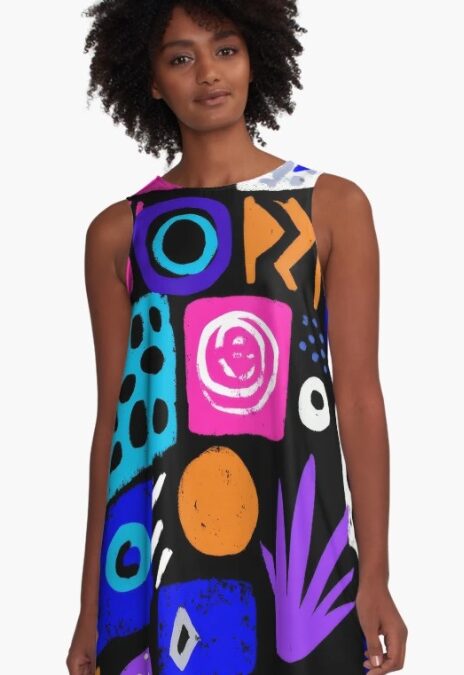
In a sea of subdued palettes and minimalist grids, Color Pop & Statement Scales unapologetically shouts for attention.
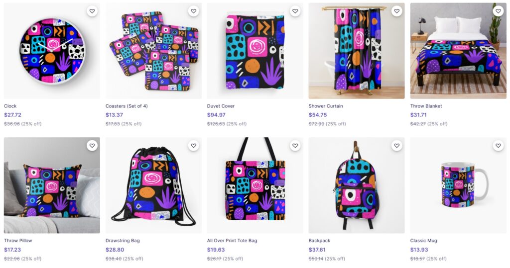
This trend thrives on high-energy contrasts, oversized graphic motifs, and clashing colors that jolt the eye and spark emotion. Whether it’s an electric fuchsia print dominating a page, or a single massive motif stretching across apparel, this style turns up the volume in every sense. CLICK HERE!
🔍 Origins: Where It Comes From
This design ethos finds its roots in:
-
Pop Art (Andy Warhol, Roy Lichtenstein): where color became commentary.
-
The Memphis Group (1980s): where visual rebellion was built into furniture, textiles, and objects.
-
Mid-century advertising & signage: where boldness equaled memorability.
These influences merge with modern tools, giving today’s creators a way to play with digital saturation, vector gigantism, and scale-driven storytelling.
⚡ Why It Works
-
Visual Energy: It wakes up the viewer instantly, great for attention-grabbing editorials or product packaging.
-
Brand Differentiation: Color pop design sticks. It screams individuality in a market of sameness.
-
Emotionally Charged: Bright color combinations evoke joy, excitement, and confidence—like wearable optimism.
-
Accessibility: High-contrast visuals help guide attention and even increase usability in certain contexts.
🧠 Where It’s Thriving
-
Editorial spreads in fashion and culture magazines
-
Tech and creative branding (especially Gen Z–focused startups)
-
Bold interior textiles and wallpapers
-
Social media and influencer content creation
-
Fashion prints that channel maximalist street style
💬 Design Vibe & Personality
-
Loud but smart
-
Bold yet polished
-
Joyful, extroverted, and confident
-
Unafraid of clashing or excess
-
Think “dopamine dressing,” but in pixels and print
🔮 What It Says About Now
In a time when subtlety can feel dull, this trend is about taking up space—visually and emotionally. It’s an aesthetic embodiment of reclaiming joy, identity, and color in a world that often feels gray.
A celebration of contrast, scale, and fearless design.