
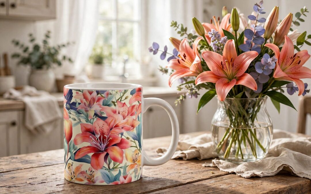
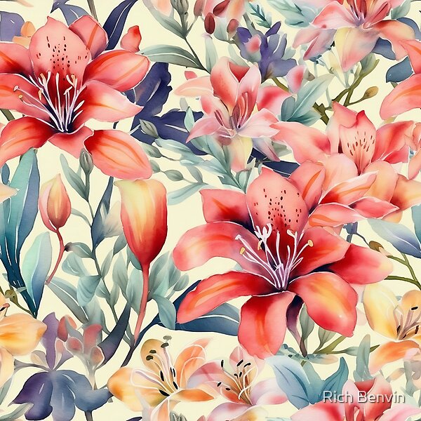
There is a particular hour in the morning when the light comes through a window at exactly the angle to make a kitchen table look like it matters. Most of us spend that hour moving too fast to notice. This design is for the people who want to notice. Watercolor Flowers lays coral lilies and blush blooms across a cream ground in loose, luminous washes — painted in water, held in light — and it asks nothing of you except that you slow down long enough to see it.
The Long Lineage of the Painted Blossom
Watercolor flowers have been teaching humans tenderness for a very long time. The botanical illustrators of the eighteenth and nineteenth centuries — the great age of hand-painted natural history — rendered each petal with a devotion that bordered on prayer, because their work was how the world learned to see plants at all. Before photography, a watercolor of a lily was the lily for most people. The painters knew this, and they painted accordingly: carefully, lovingly, as if the flower’s survival depended on their attention.
That tradition runs forward in an unbroken line to the cottagecore moment, to the romantic floral art pinned and posted across every feed, to the current hunger for softness in a world that has not been soft to anyone. The appetite hasn’t changed in two centuries — only the medium. We still want, as we have always wanted, to look at something gentle and feel our shoulders drop.
The watercolor medium is part of the meaning. Oil paint can be corrected; acrylic can be covered. Watercolor cannot be lied to. Every wash is a single commitment of water and pigment, and the painter must let it be what it is. There is a philosophy in that: softness requires surrender. The bloom looks effortless precisely because the artist let go at the right moment.
What the Lily Has Always Meant
Among flowers, the lily carries a particularly old weight. In the ancient world it was tied to renewal — the bulb that dies back into the earth and returns, reliably, every spring, as if to argue that nothing beautiful is ever truly gone. In the Christian tradition it became the emblem of devotion, of purity of intention. Across cultures, the message converges: the lily is the flower of what endures quietly, of what comes back, of devotion as a daily practice rather than a dramatic gesture.
Coral and blush are not shy colors, for all their softness. Coral pink (#F2807C) is warmth made visible; raspberry blush (#E85D75) is affection with a pulse. The supporting cast — soft lavender (#B48BC4), sage green (#7A9E8E), dusty blue-gray (#8FA8B8) — holds the cream ground (#F6EDE0) in a gentle balance that reads as calm without ever reading as cold. This is a palette that understands the difference between quiet and empty.
“Painted in water, held in light — blossoms that never wilt.”
That is the design’s quiet promise: a springtime that does not depend on the season. Flowers you can keep through winter, through the gray months, through the weeks when nothing outside your window is blooming. A garden you can hold.
Softness, Carried Into the Day
The floral coffee mug is perhaps the most honest product this design lives on. Morning is the day’s hinge, and the object you hold in that first hour sets something in you — a floral mug says the day begins gently. The botanical notebook version does similar work: a journal cover of watercolor lilies makes the act of writing feel less like administration and more like tending.
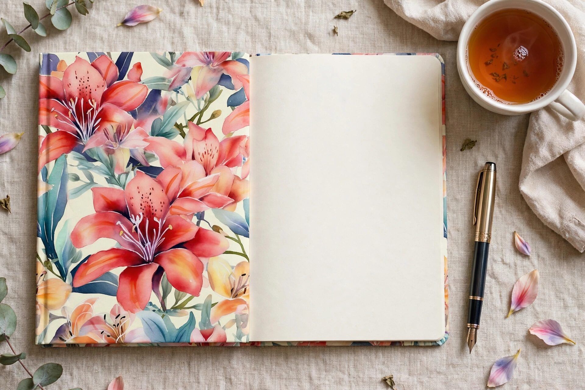
On tote bags and throw pillows, the effect scales outward. These are not loud objects. They are the kind of objects that visitors notice on the second visit, that friends comment on quietly, that end up in the background of photographs looking like they were always there. Softness works that way — it doesn’t announce itself; it accumulates.
A Quiet Garden in a Loud World
There is an argument — and it is this design’s whole argument — that softness is not the absence of strength but one of its forms. It takes more resolve to stay gentle in a loud world than to match its volume. The lily does not compete with the storm. It waits, it returns, it blooms again in exactly the same place. That is not fragility. That is a strategy.
Of our twelve founding Shop Classics, this is the gentle one — the design that proves the collection has range, that Hashola can shout in neon and also whisper in watercolor. Both are true. Both are ours.
Keep a Little Springtime Within Reach
Explore Watercolor Flowers on mugs, notebooks, tote bags, and more — and wander the rest of the founding collection at the Hashola shop on RedBubble. Some art wants your attention. This one wants your morning.